Academy Museum of Motion Pictures
Creating scalable design systems and optimized navigation
Visit Website →
Problems
Museum website's poor mobile experience reduces visitor engagement and ticket revenue.
Solutions
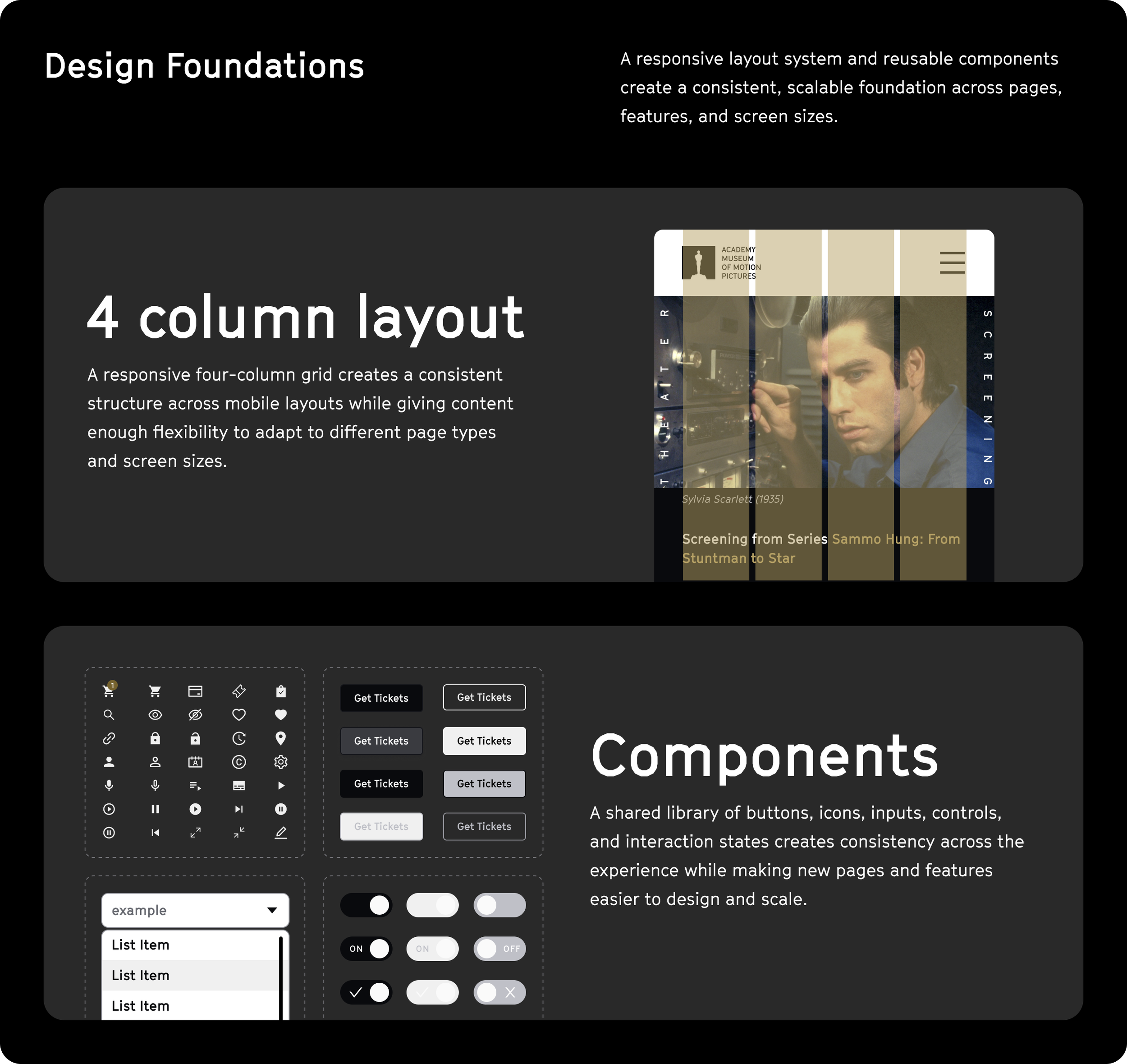
1. Built a design system that ensured design consistency for mobile and desktop experiences, including over 200 components optimized for CMS integration
2. Conducted a heuristic evaluation of the ticketing purchase flow, and redesigned the UI and user flow for an easier checkout process
A New Front Door to the Museum
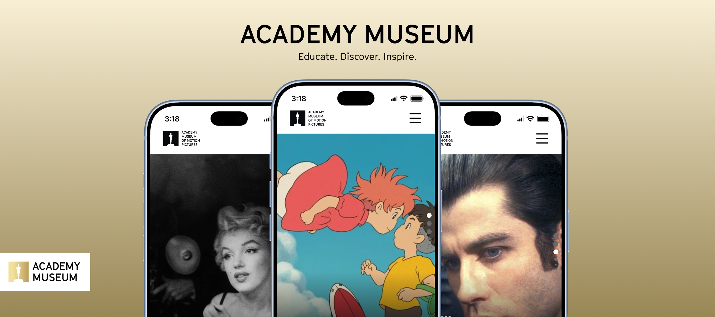
A redesigned homepage that puts exhibitions and programming front and center while making essential visitor information easier to find. The responsive experience adapts seamlessly across desktop and mobile.
From Discovery to Visit
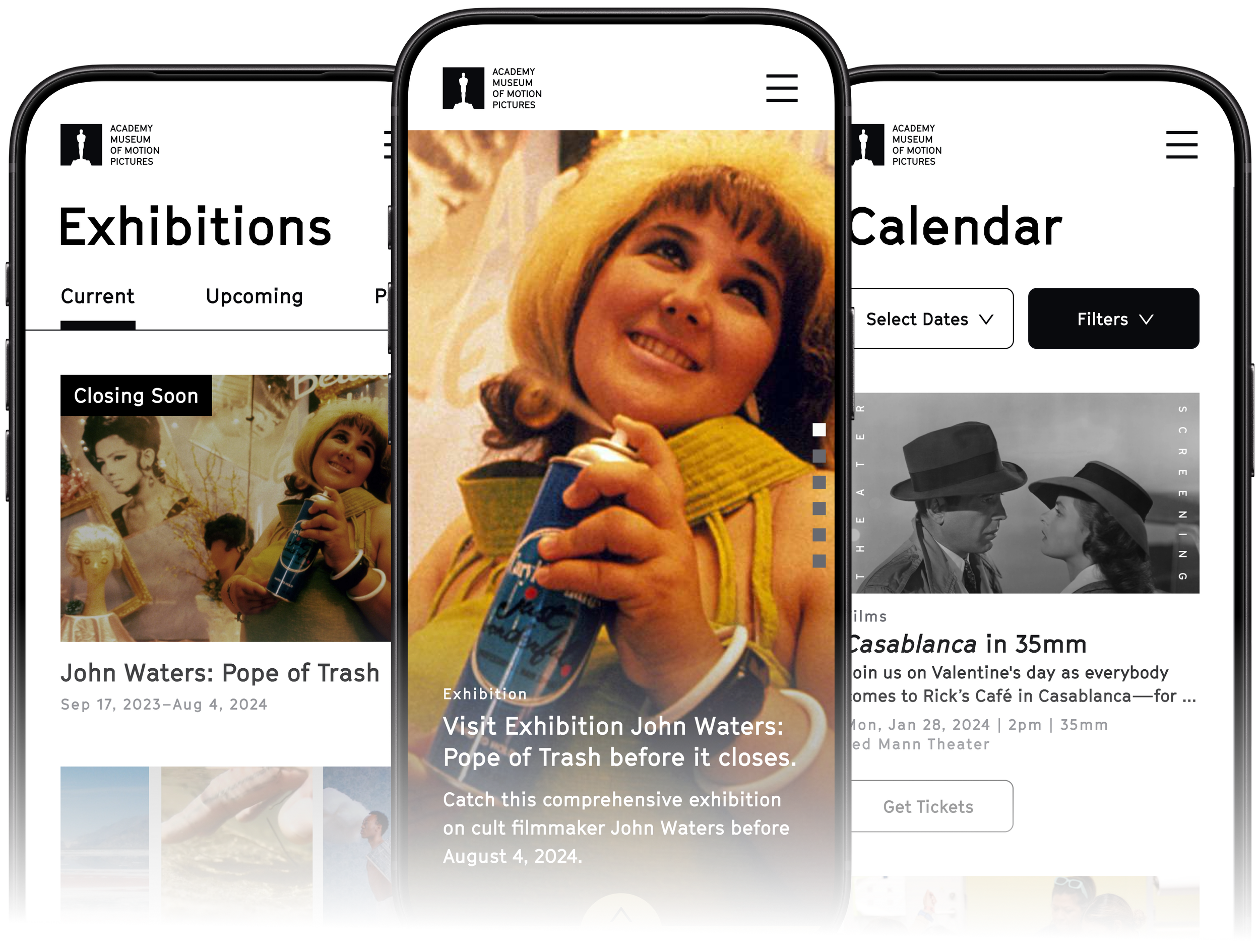
The mobile experience connects discovery, planning, programming, and ticketing into a cohesive journey—making it easier to move from exploring what's happening at the museum to planning a visit.
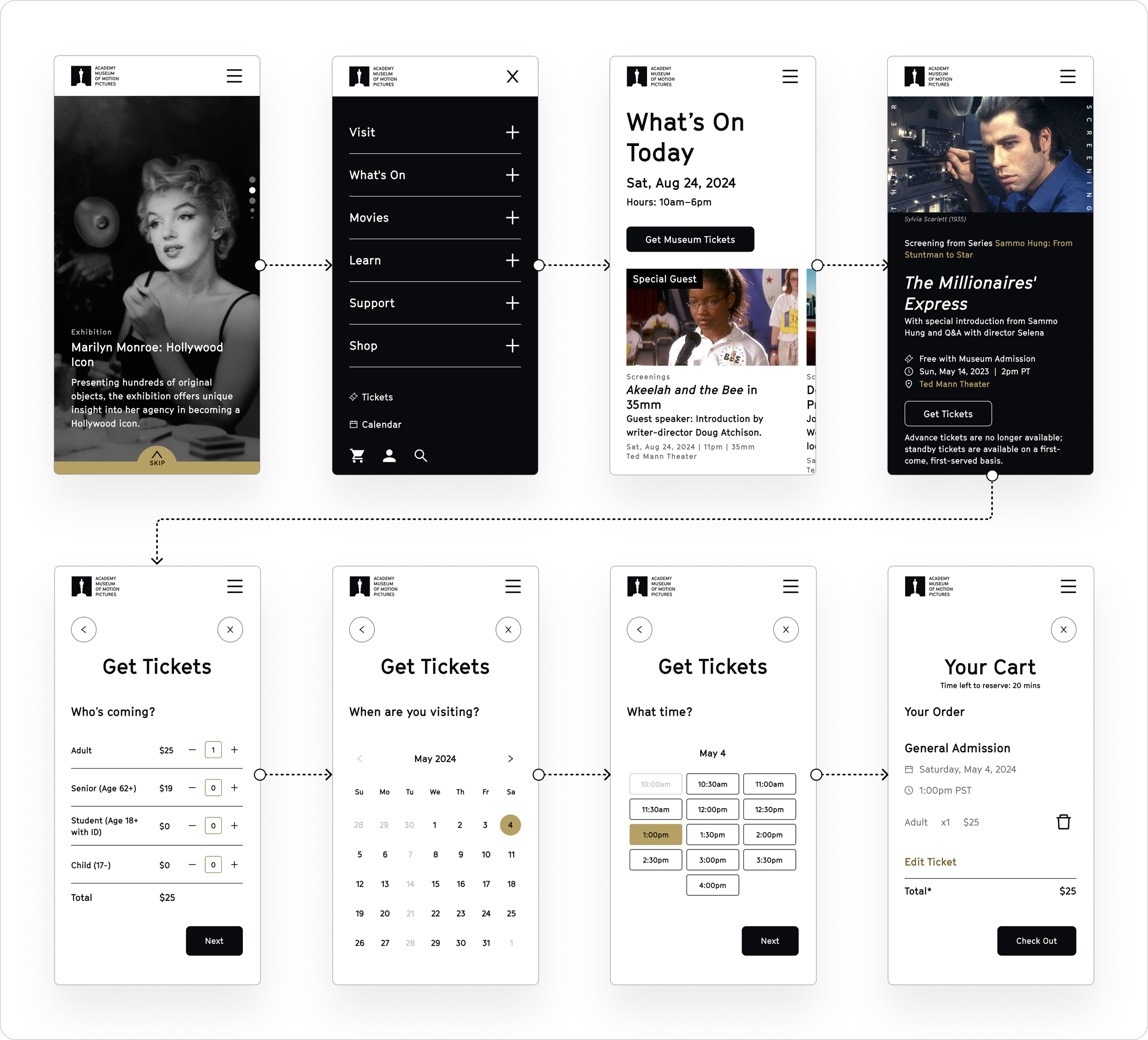
Find What’s Happening
A more intuitive way to explore what’s happening at the museum. A new date picker and expanded filters make it easier to browse by date, narrow results, and discover relevant programming.
From Film Discovery to Tickets
Responsive screening pages make the museum’s film programming easier to browse across desktop and mobile, with clearer event details and prominent ticketing actions that create a more direct path from discovery to attendance.
Designing for the
System Behind the Site
Mapped legacy pages and existing CMS modules to the new component system, identifying gaps and defining how redesigned experiences could be supported within the existing content structure.
A Visual Language Rooted in Cinema
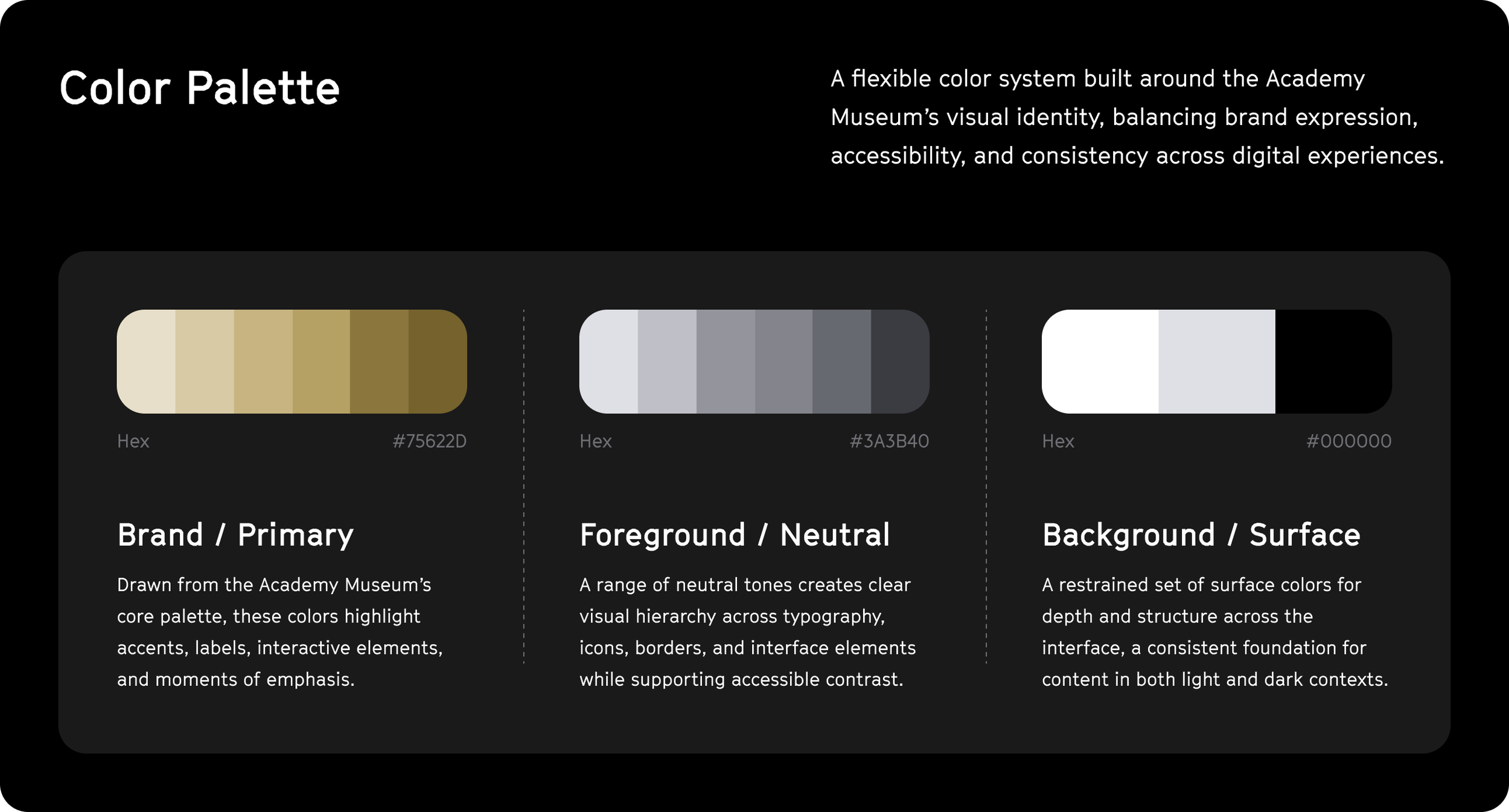
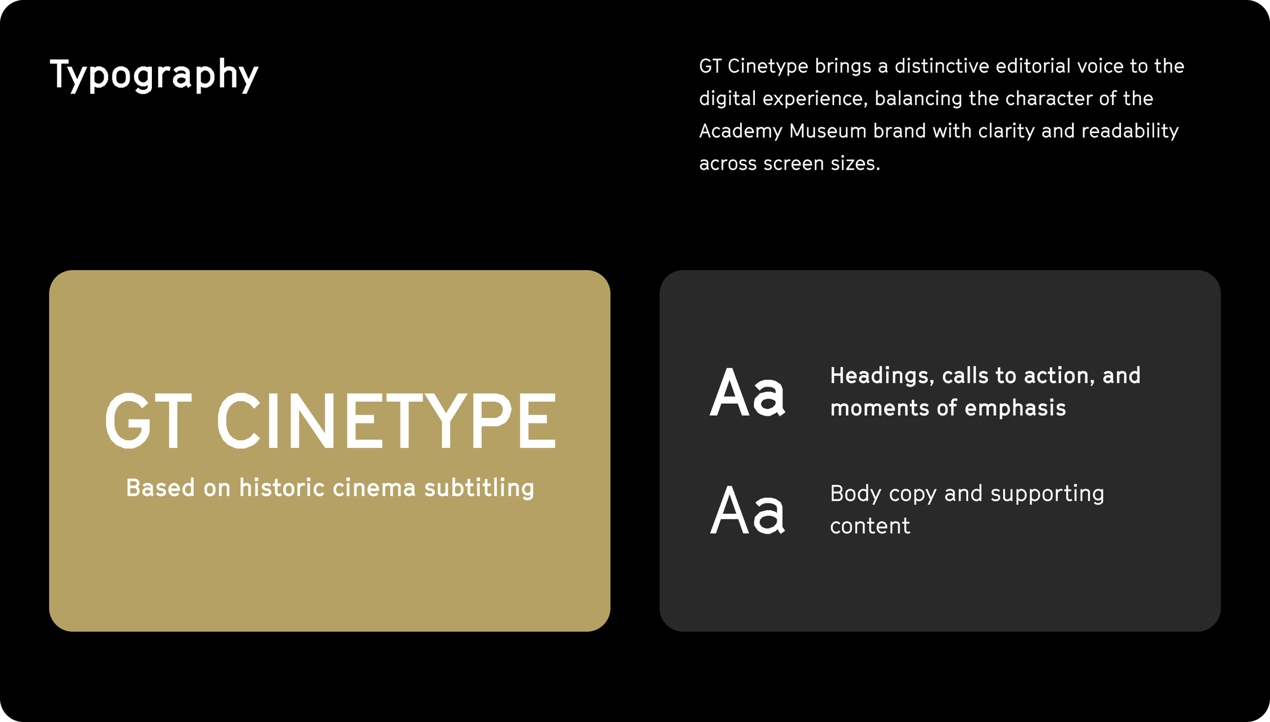
A flexible system of color, typography, and reusable components translates the Academy Museum’s visual identity into a consistent digital experience, creating a foundation that can scale across pages, screen sizes, and content types.