AXS
Visit Website →
Problems
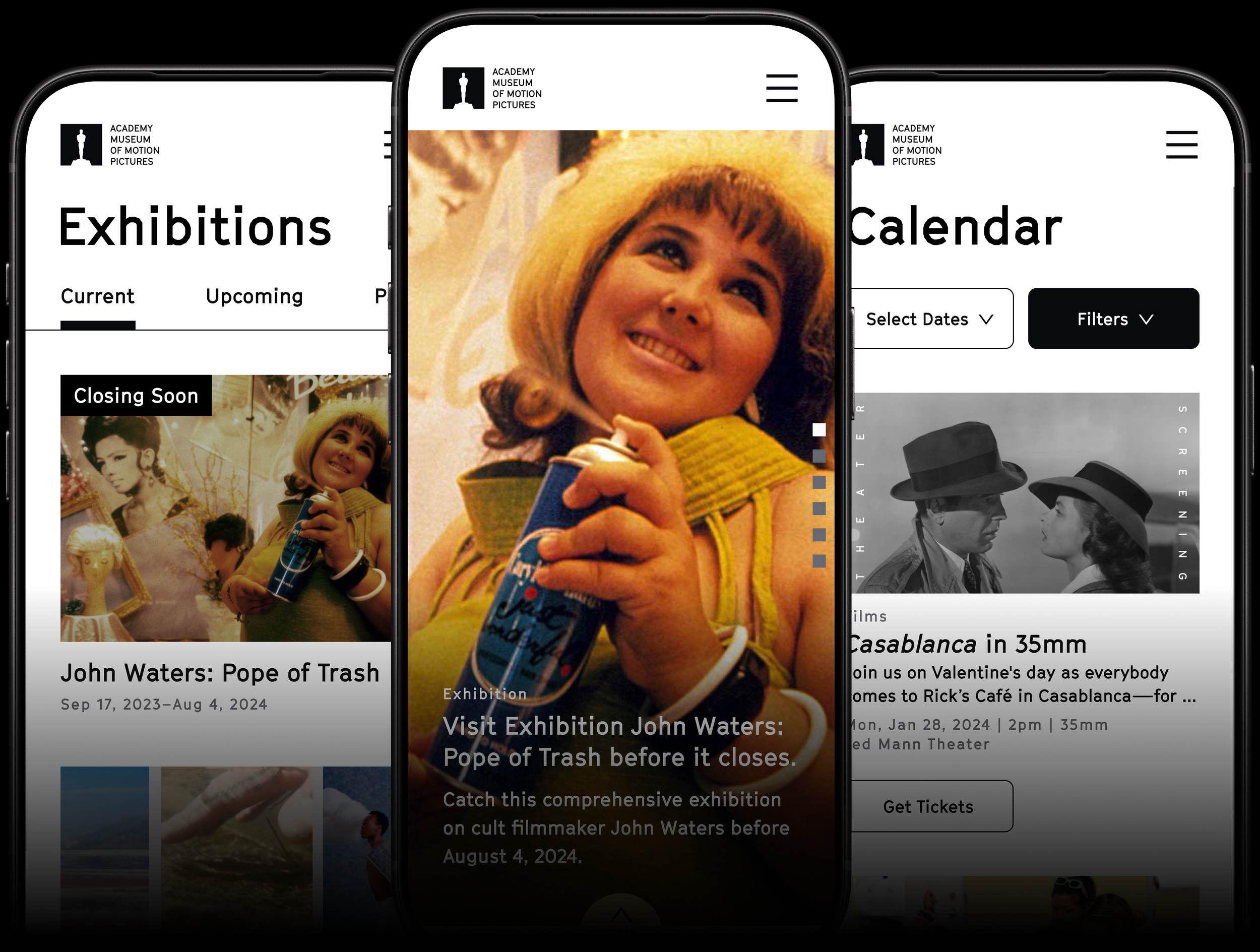
Museum website's poor mobile experience reduces visitor engagement and ticket revenue.
Solutions
1. Built a design system that ensured design consistency for mobile and desktop experiences, including over 200 components optimized for CMS integration
2. Conducted a heuristic evaluation of the ticketing purchase flow, and redesigned the UI and user flow for an easier checkout process
A better way to search
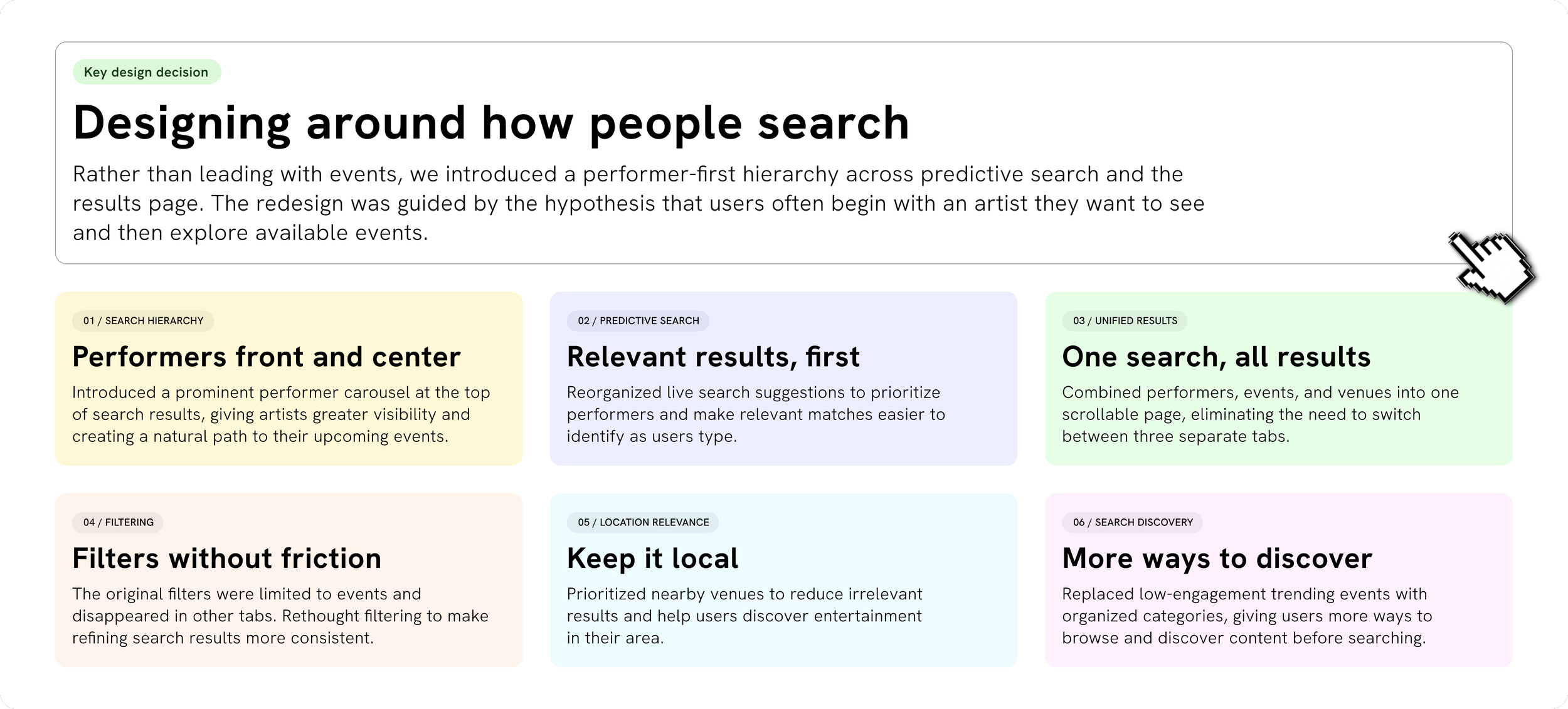
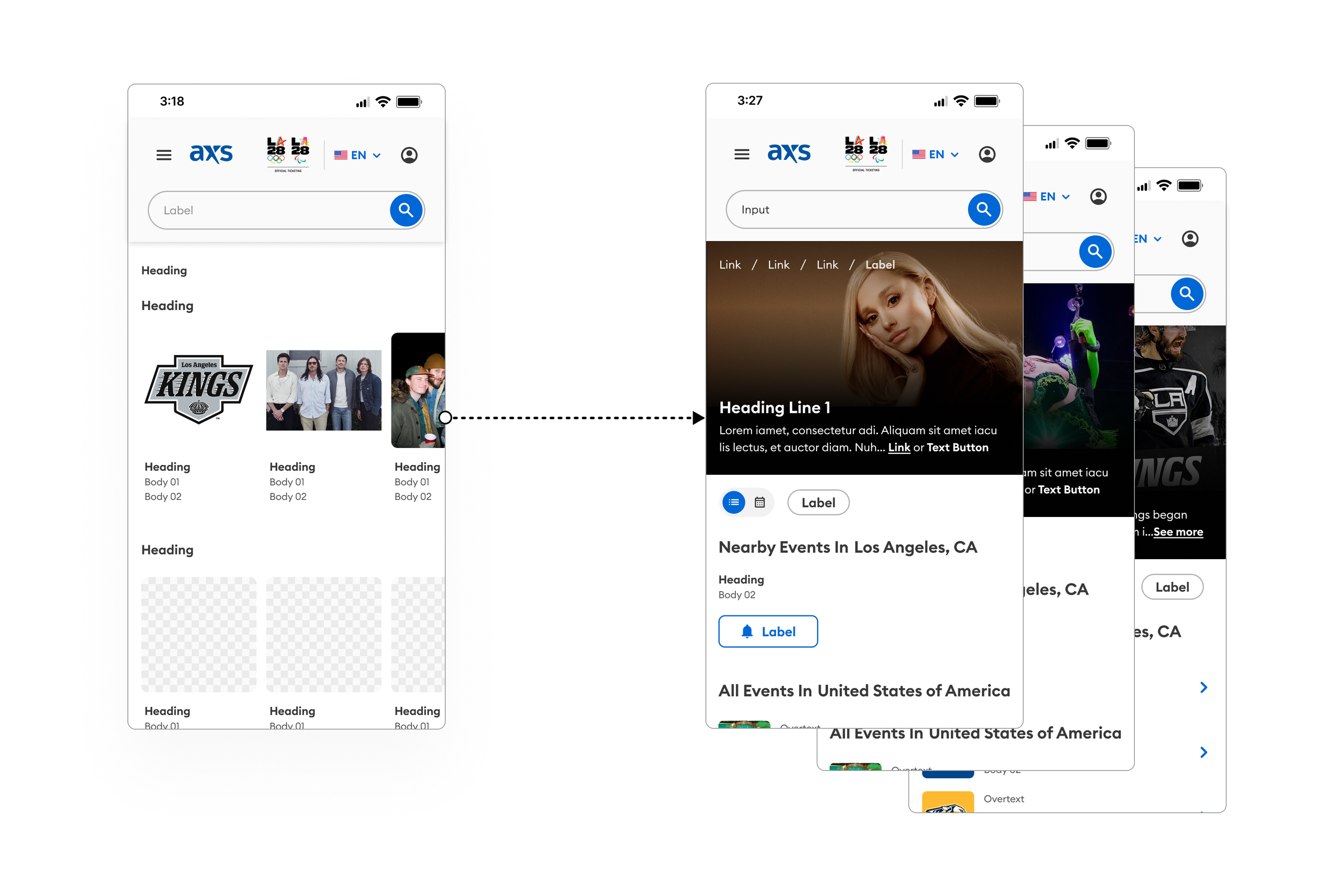
A redesigned search experience that simplifies navigation, prioritizes relevant results, and creates more intuitive ways to discover content. By introducing a performer-first hierarchy, unifying search results, and expanding browsing options, the redesign helps users explore artists, events, and venues with greater ease.
Prototype gif here
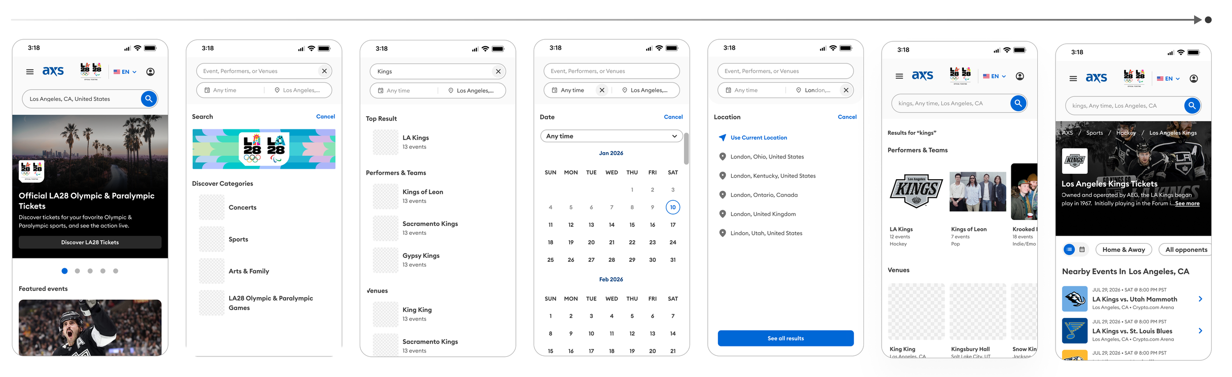
ONE SEARCH, ALL RESULTS
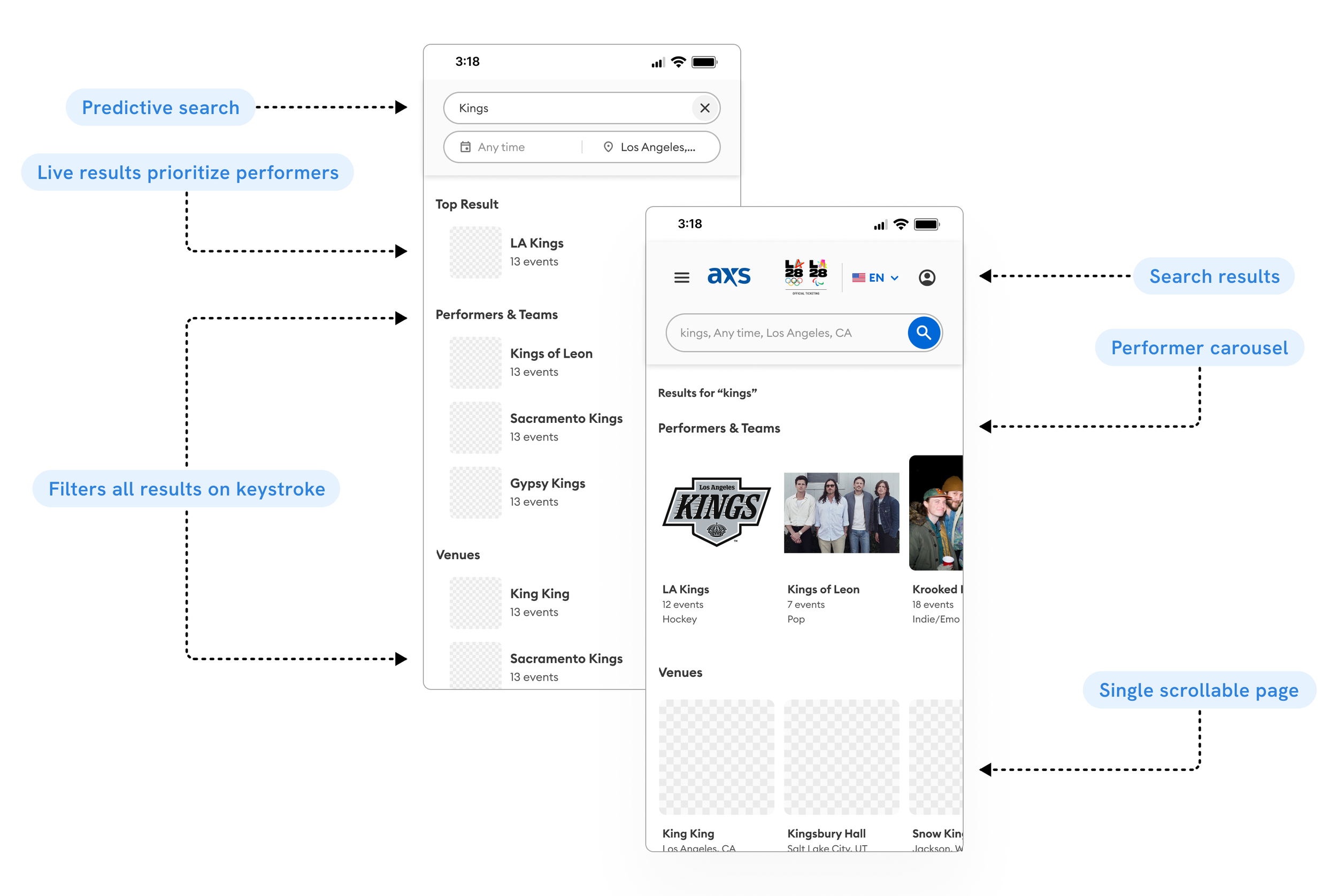
PERFORMERS FRONT AND CENTER
THE CHALLENGE
Search wasn’t built for discovery
The original experience separated events, performers, and venues into three tabs, prioritized low-engagement trending events, and offered inconsistent filtering. Results could also surface venues outside the user's area.
Thes limitations created an opportunity to rethink how people discover live entertainment, not just how they search for it.
Show old
RETHINKING HOW USERS DISCOVER
DESIGN RATIONALE
What changed & why
Making search easier to explore, more consistent, and more relevant. The redesign shifts the focus toward how users naturally discover live entertainment, prioritizing performers, introducing new ways to browse, and bringing events, artists, and venues into a unified experience. By improving the search hierarchy, simplifying navigation, and surfacing more relevant results, we created a more intuitive path from initial discovery to finding the right event.
Hero image here
comparing old vs new